Project 9: Music Interpretation

Music-Poster---Jersey-Boys

The goal of the final project, music interpretation, was to choose a song and visually create the song into a composition. For example, for given tone changes, rhythms and musical gestures, reconstruct those into the composition to create a visual representation.

My chosen song was “Sherry” by Jersey Boys, a song that I believed had many overdramatized musical elements, which would allow me to take advantage of the assignment. The quartet’s combination of voices allows for such a range of pitch, which allowed me to play with the positioning of the word/letters to mimic the changes throughout the song. To represent the backup singers, I decreased the size of their lyrics, putting them very close to the main singer’s part to show that they are there to complement his words.

I also chose to put in the background a shadow of a girl in a skirt, replicating the girl in the song. The orange, salmon, white, grey, and black are the colors I most think of when I listen to their music, which is why I complimented the shadow with blocks of these colors.

Project 7: Name Poster

Name-Poster-2.2

In the Name Poster project we were to design our name in five different ways which were to come from five different themes: art, music, architecture, dance, and poetry.

The first theme shows my name in the theme of art. In this design I wanted to incorporate the broadness of art. The black crazy spiky zig zags are supposed to idealize how art can be random, fascinating and unorganized. Paired with the light blue, the colors were to compliment each other, yet contrasting in such where the blue really stands out. I also like the way the letters look hand written, kind of reminding us of the traditional drawing methods.

The second theme was music. The idea of this design comes from the equalizer bars that bounce up and down to the beat of the music. This design is my favorite out of the five.

The third theme was architecture. The first three letters of my name, ‘Ale’, are angled with the last three letters, ‘yna’, to show the angles seen in houses. The large ‘K’ is to replicate a large building and the ‘apur’ stacked in yellow and black is to represent a tall building seen in cities, with lights on at various levels of the building, however the emphasize was to show height.

The fourth name was created with the theme of dance. This theme was most difficult for me because I have very little background in dance and replicating it proved to be challenging. I wanted to emphasize the whimsacleness of dance like dancers flowing their arms around or leaping using the pink arcs and the swirl at the end. The first part of my name was done in the typeface Party LET Plain:1.0  which was to show the playful and creativeness of dance. The last name was made using one of the photoshop effects. I think this adds to the idea of choreography in dance, where the creation can flow yet be rigid at the same time.

The last name was done in the light of poetry. I also really enjoy how this composition turned out. I like the typeface in light gray that acts as a shadow of the black letters. I added some small light gray circles in an attempt to emanate how old paper is crinkly and the letters smear in the paper.
Project 6: Music Poster

Music-Poster-3

In this project, it was a requirement to choose an artist and create a music poster that advertises a hypothetical new mix album. The poster needed to include design qualities that characterized the performer’s music and style with emphasis on typographic expression.

The artist I chose for this project was Frank Sinatra, his singing career based mostly in the swing era. My vision for this poster was to create a modernized look, utilizing solid colors while minimizing texture, then radiating various images away from Sinatra’s portrait. This was done with semi-circular rings of blank and white, lined with trumpets on the exterior, mimicking the look of a stage in his background. In his music, the jazz band, especially the trumpets were key to the sound of his music. The red, black, and white set the poster in evening stages, where people gather for a stylish type of events.

The “Mona Lisa Solid ITC TT” font seemed to capture that old-time, high-class feel of fancy nights where you would hear Sinatra’s music.

Project 4: Phrases

Screen Shot 2014-11-05 at 12.46.25 PM

Screen Shot 2014-11-05 at 12.46.39 PM

Screen Shot 2014-11-05 at 12.46.53 PM

This project was my first encounter using the adobe software Illustrator. Learning to use it has helped me beyond my art classes, since it is a great software to create diagrams which I have used in my lab reports. However since it was my first time using it, I was slightly overwhelmed by all the capabilities the software makes available. The goal of this project was to choose a quote and properly create three successful design with it, our name, class title, year, and the words ‘Typography Portfolio’. The idea was to explore change and iteration between the three designs. This being my first time using Illustrator, I think I was too eager to try all of the effects and types that led to create a design that I think could have been more successful.

The quote chosen: “I want to make beautiful things, even if nobody cares, as opposed to ugly things. That is my intent.” – Saul Bass

The first design was geared toward playing with different boxes of color to emphasize different aspects of the composition. The second design was an attempt to replicate the ‘coffee shop’ look that they create on their chalk boards. Typically they have the words condensed into a block of text with various lines and shapes. I think this composition could have been more effective if the text on the left side was incorporated to the quote. The idea for the third design was to have the stiletto represent ‘beautiful things’ in the quote and it was supposed to be crushing or stepping on the ‘even if nobody cares’ part of the quote. I think this was an effective idea, however there are too many different visual aspects that crowd or disorganize the composition.

Project 3: Found Type

Project 2

The third project, Found Type, allowed the students to create a connection between lessons learned in typography from class to real-life signage used by the various stores and restaurants seen in town. Walking around the streets of Ann Arbor, MI, I photographed many store signs where typography was evident. The first place I noted was a retailer named ‘Ragstock’ which utilized the typeface of Helserif Medium OT Std, notice that their name is in all capital letters. Next was a boutique called ‘The Bead Gallery’ which i quickly recognized the type in my library of fonts on my computer called Harrington. The third shop was an antique shop called ‘Antelope Antiques & Coins’, which utilized the typeface of Academy Engraved LET, characterized by the white space used in the typeface. Then I came ‘Oxford Companies’, a real estate business, which utilized a type face that looked familiar but was hard for me to identify. To me, it appeared to look similar to Engravers MT or a bolded Times New Roman. Lastly, there was a restaurant called ‘Ashley’s’ which clearly used American Typewriter in its sign.

Project 2: Fragmented Letters

Project 3 pic

The goal of Fragmented Letters was to emphasize contrasts seen in typography cut from various magazines and then play with the alignment to create a unique composition. The idea behind my composition was to create a crack like appearance through the letters, replicating the look of cracked glass. To create this look, I either shifted or inserted new typeface between different zones. By doing this, it creates a clear cut between the typeface in an effort to allude to a crack. Lastly, the letters assembled in this design were to spell out the word “creator,” as that is what artists are.

Project 1: Letter Construction

project 1 picProject 1, 2nd Pic

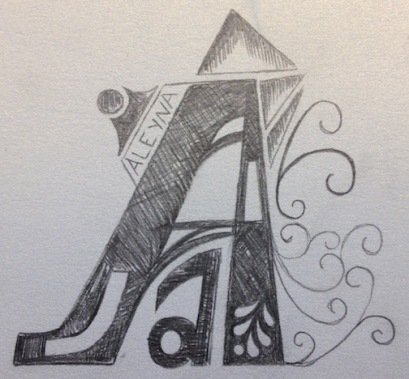
The goal of this project was to successfully recreate a letter in a larger proportion using a grid and traditional drawing methods. By doing this, the details and curves that make up the word become more apparent. Drawing this letter out really forces you to look at the true structure of the letter, seeing it not as a letter that is to be read but as an art form made from different shapes and curves.